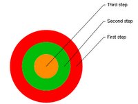
1. The Target is the most rediculous: This is to be "used to show steps toward a goal." The first thing you notice is that the steps are in the wrong order--bottom to top. There's no way to change this since the text and links are immovable. They beg to be dragged around the shape until they're positioned just right, but they won't budge. You can apply some pretty eye-catching styles to your bullseye, though.
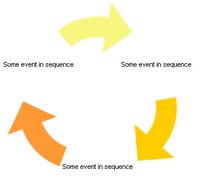
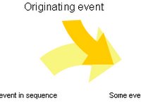
2. The Cycle is meant to "show a process with a continuous cycle." That's fine if the cycle you want to illustrate really has no
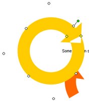
 beginning or end. I tried to flip one of the arrows to show how an event might enter the system, but these arrows are stuck like a tram on a cable. The best I could do was copy and paste one and grab at those weird MS Office graphics manipulation handles until one of them flipped it over. Even then, the most the intruding arrow can do is lie on top
  of one that's cemented into place. The handles are flights of fancy you can use to distort the arrows into whimsical but useless shapes, like this nice donut I made.

No comments :
Post a Comment